For many, Christmas evokes images of a vibrantly decorated evergreen, adorned with red and green baubles, twinkling lights, and a star perched proudly on top. However, in recent years, a new trend has emerged, one that embraces a cooler, more elegant aesthetic: the white Christmas tree with blue decorations. This unique combination offers a refreshing take on holiday decor, creating a winter wonderland that is both serene and captivating.
The Allure of White
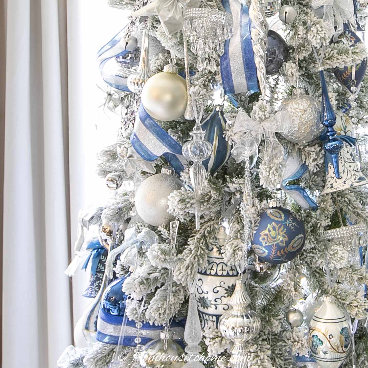
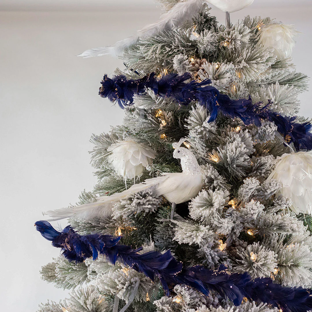
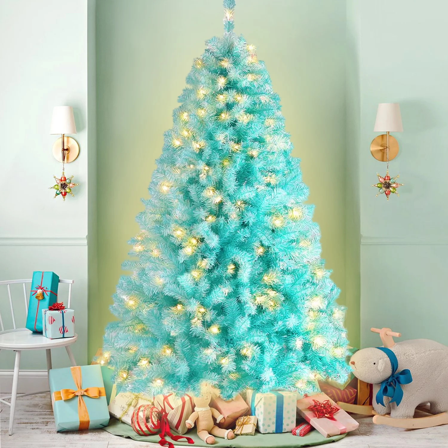
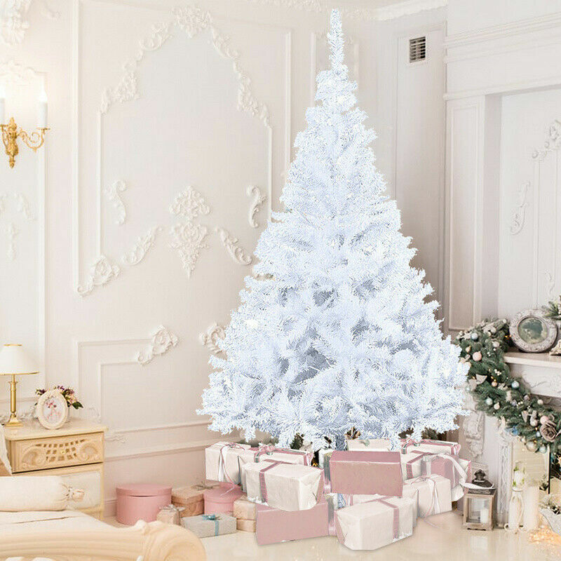
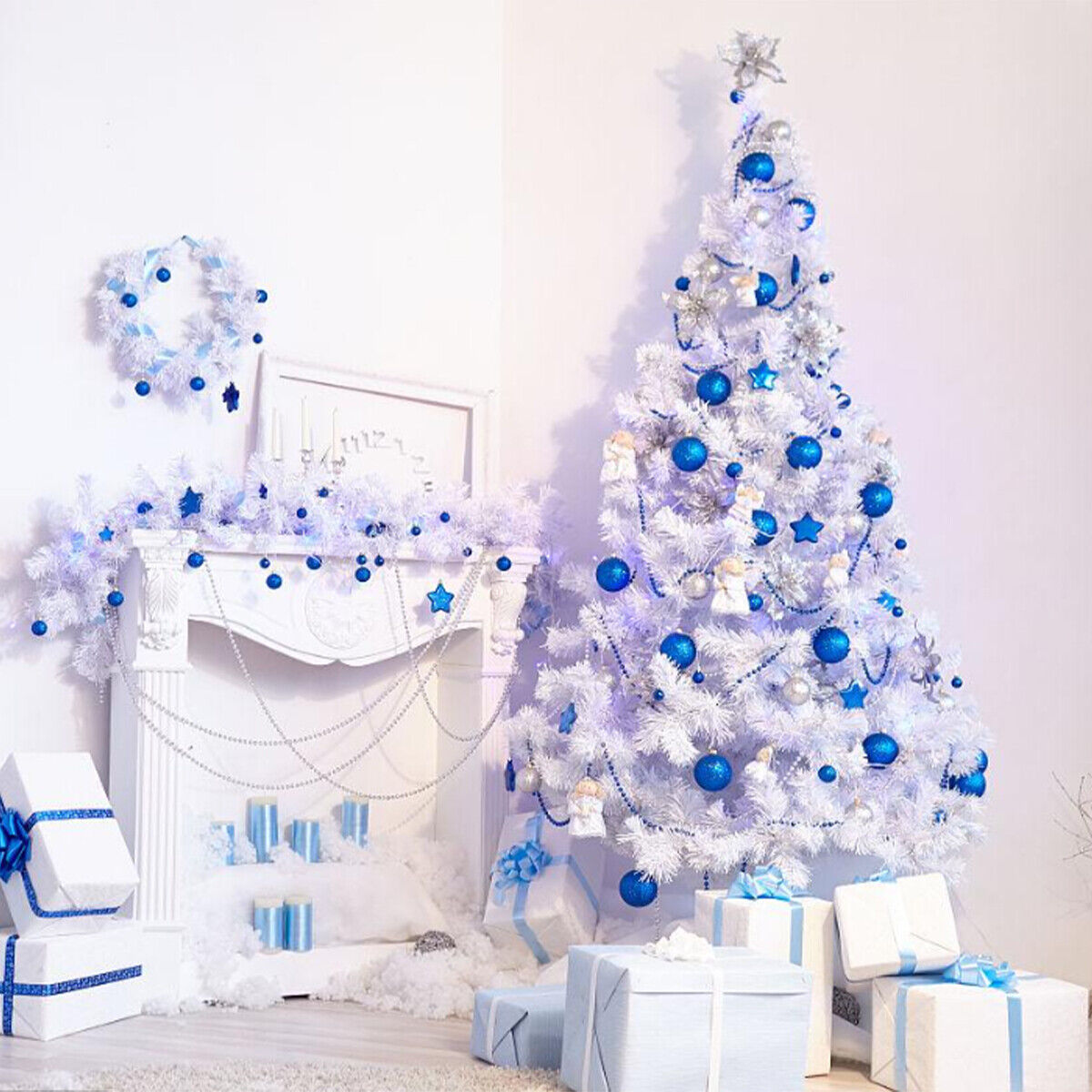
The white Christmas tree serves as the foundation for this wintery theme. Unlike its traditional green counterpart, the white tree doesn’t compete with the ornaments; instead, it provides a blank canvas that allows the blue decorations to take center stage. The white hue evokes feelings of snow-covered landscapes, pristine winter mornings, and a sense of calmness that is perfect for the holiday season.
A Spectrum of Blues
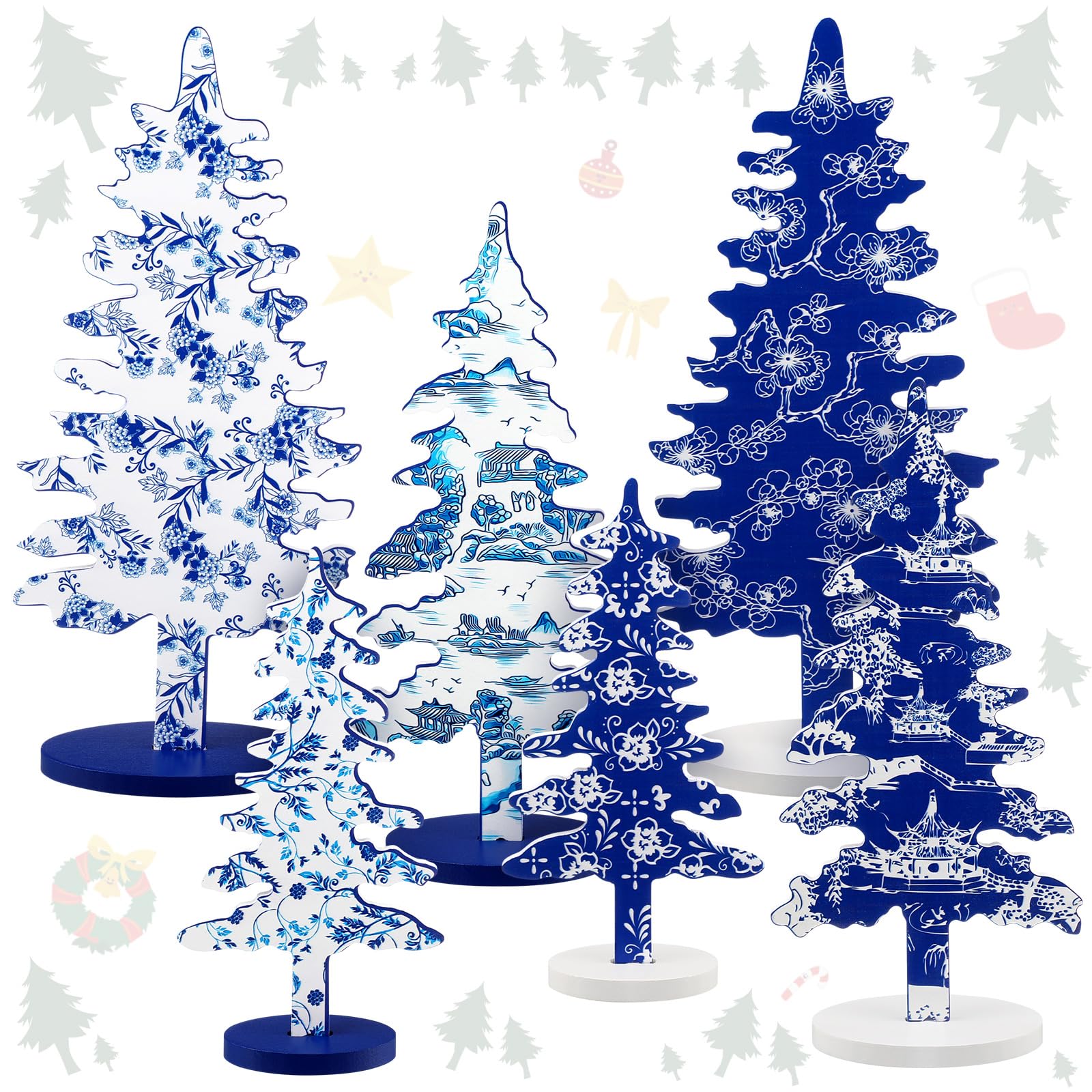
While the color blue is the star of the show, there’s plenty of room for creativity within this palette. Royal blue ornaments add a touch of grandeur, while a lighter shade of sky blue creates a more whimsical feel. Don’t be afraid to incorporate different textures as well. Shiny baubles will reflect the light beautifully, while matte ornaments add depth and dimension.
Winter Wonderland Elements
Beyond the blue hues, there are a number of decorative elements that can further enhance the winter wonderland theme. Silver snowflakes scattered throughout the branches add a touch of magic, while frosted pinecones bring a touch of rustic charm. String lights with a cool white or blue hue cast an ethereal glow, mimicking the soft light of a winter moon. For a truly whimsical touch, consider incorporating miniature houses, snowmen, or woodland creatures into the decor.
A Touch of Elegance
For those who prefer a more sophisticated look, the white and blue color scheme can be easily elevated with a touch of silver or icy white. Silver garland interwoven between the branches adds a touch of shimmer, while glittery snowflakes or frosted pinecones create a sense of understated luxury. Consider using white ornaments with intricate silver detailing or blue ornaments with a pearlescent finish. These subtle touches add a touch of glamor without overwhelming the wintery aesthetic.
Matching the Decor to Your Space
The beauty of the white and blue Christmas tree is its versatility. This color scheme can be adapted to fit any style of home decor. For a modern space, keep the ornaments clean and simple, focusing on geometric shapes and metallic finishes. In a more traditional setting, incorporate elements like snowflakes with intricate cutouts or miniature glass houses with a vintage feel.
DIY Magic
For the crafty individual, the white Christmas tree with blue decorations presents a wonderful opportunity to unleash your creativity. You can easily transform plain white ornaments into winter masterpieces with a coat of blue paint, a sprinkle of glitter, or a delicate snowflake design. Pinecones can be frosted with white spray paint and embellished with tiny blue ribbons. Homemade snowflakes crafted from paper or felt add a personal touch and a unique story to your winter wonderland.
Beyond the Tree
The white and blue color scheme can extend beyond the Christmas tree itself, creating a cohesive and visually stunning holiday display throughout your home. Decorate your mantelpiece with white candles and blue snowflakes. Place frosted vases filled with silver ornaments on your side tables. String blue fairy lights across doorways or bookshelves. By incorporating these subtle touches, you can create a truly immersive winter wonderland experience.
Discuss how a careful selection of complementary colors can elevate the overall visual appeal
The world of color is a powerful tool for designers, artists, and even everyday people to create visually appealing spaces. Understanding how colors interact with each other is key to unlocking this potential. Here’s how a careful selection of complementary colors can elevate the overall visual appeal of something:
Harmony Through Contrast:
Complementary colors sit directly opposite each other on the color wheel. Think of a red fire truck and its bright yellow caution stripes. This strong contrast creates a dynamic and eye-catching effect. When used strategically in a design, complementary colors can make each other stand out more vividly. For example, a room painted in a calming blue might feel more serene with pops of orange in the throw pillows or artwork. This contrast between the cool blue and the warm orange creates a more dynamic and engaging space.
Balancing Act:
While complementary colors create a strong visual pop, using them in equal proportions can be overwhelming. The key is to find a balance. A common approach is the 60-30-10 rule. In this scheme, 60% of the space uses a dominant color, often a neutral tone like white or beige. This creates a foundation. Next comes the complementary color, used at 30%. This injects the necessary energy and vibrancy. The final 10% is an accent color, perhaps a darker shade of the complementary color or a completely different hue used for smaller details. This approach ensures the complementary color enhances the design without overpowering it.
Evoking Mood and Emotion:
Different color combinations can evoke specific moods and emotions. Complementary colors can be particularly effective in this regard. For instance, the aforementioned blue and orange combination can create a sense of energy and excitement. Conversely, a pairing like green and red, while complementary, feels more balanced and harmonious. Understanding these emotional associations allows designers to tailor their color choices to the desired atmosphere. A restaurant seeking a vibrant and stimulating environment might use a complementary scheme like orange and teal, while a spa aiming for tranquility might opt for calming lavender and a contrasting yellow.
Beyond the Basics:
The world of color goes beyond simple complementary pairings. Analogous colors, which sit next to each other on the color wheel, create a more harmonious and unified feel. Triadic colors, forming a triangle on the wheel, offer a vibrant and dynamic option. Understanding these different color relationships allows for more nuanced and creative approaches to design.
In conclusion, a careful selection of complementary colors can significantly elevate the visual appeal of a space. By harnessing the power of contrast, achieving balance, and considering the emotional impact of color combinations, designers and individuals alike can create visually stunning and evocative environments.
A Focal Point for Memories
The white Christmas tree with blue decorations is more than just a beautiful aesthetic choice; it’s a conversation starter and a focal point for creating lasting holiday memories. As family and friends gather around the tree, they’ll be drawn to its unique beauty and tranquil atmosphere. Perhaps you’ll share stories of past Christmases, sing carols together, or simply enjoy the quiet peacefulness of the winter wonderland you’ve created.
So, this holiday season, consider stepping outside the traditional red and green box and embrace the cool elegance of the white Christmas tree with blue decorations. With its versatility, creative potential, and ability to evoke a sense of winter magic, this unique theme is sure to become a cherished part of your holiday traditions.